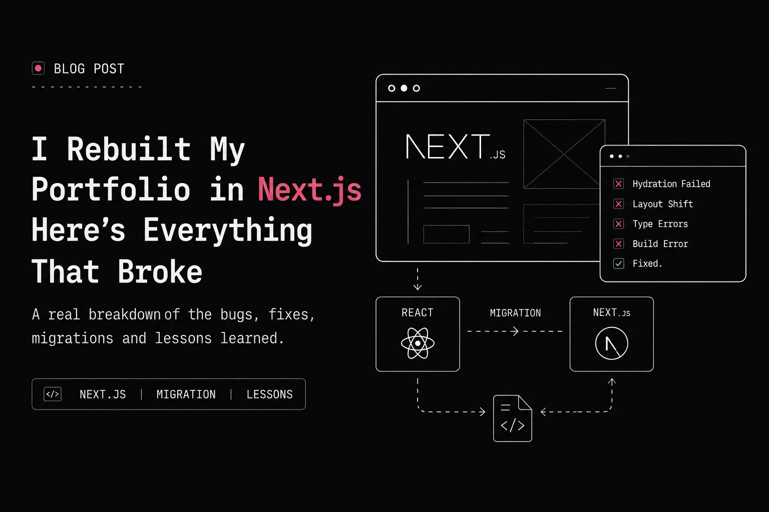
I said I'd do this in 30 days. It took less, then more, then less again — because that's what actually building something looks like, not what a roadmap says it'll look like.
Here's the real story, not the highlight reel.
Why I did this at all
I'd already been through tutorial hell twice — once with React, once with Node.js. Watch a tutorial, follow along, feel like I understood it, then sit down to build something on my own and realize I didn't actually know anything. Just muscle memory from typing what someone else typed.
So when I decided to learn Next.js properly, I made one rule for myself: watch the section, then build something different from what the tutorial built, using only what I actually retained. Not blind — I'm not trying to reinvent App Router routing from first principles — but not copy-paste either. If I couldn't build a similar app without the video open, I didn't actually learn the section.
That rule is the only reason this migration turned out the way it did.
Three portfolios, not one
This wasn't my first portfolio. It wasn't even my second.
- Version one was a terminal-style single page site — HTML, CSS, vanilla JS. No routing, no build step, just me and
localStorage. - Version two was React, client-side routed, Tailwind, inspired by portfolios like Chanh Dai's — hairline borders, clean grid structure, no shadows. That version got me pretty far. But it was a pure SPA, and once I started thinking seriously about SEO and actually wanted search engines to see my content instead of an empty
<div id="root">, I knew it had a ceiling. - Version three is this one. Full rewrite. Next.js 16, App Router, TypeScript from the first commit, Tailwind v4. I didn't copy any existing repo's structure wholesale — I looked at a few (Chanh Dai's had a components registry baked directly into the portfolio, which inspired the idea, but his repo was deep enough in nested folders that I got lost trying to understand it as a beginner). I built my own version, my own way, and kept it flat where flat made sense.
The migration itself: boring, and that's the point
I branched off main, tagged the old React version as react-version-final so I could always get back to it, and started porting component by component — navbar and footer first since they're shared everywhere, then static pieces, then anything that touched data.
Every commit was scoped: migrate: for a clean port, fix: for anything I caught broken afterward. By the end I had over a hundred commits on that branch. That wasn't for show — it meant if something broke, I could actually find which component broke it instead of guessing across a handful of giant commits.
The boring discipline is honestly the part I'm most proud of. Not the flashy stuff.
The bugs that actually taught me something
Three bugs from this migration stuck with me, because each one taught me something about how Next.js actually works, not just how to make an error go away.
1. The theme flash
Dark mode was stored in localStorage, which only exists in the browser — but the server has no idea what's in it, so every page loaded light first, then flashed to dark once React hydrated and read it. My first fix made it worse — a stray useEffect was reading localStorage after mount and re-triggering the toggle a second time, so I went from one flash to two. I ended up moving to a cookie-based approach: the server reads the theme cookie directly in layout.tsx and renders the correct class before any HTML reaches the browser. No flash, because there's no "wrong then corrected" moment anymore.
2. The PDF viewer that broke my build
I added react-pdf to my resume page, and the build started throwing ReferenceError: DOMMatrix is not defined. Took me a minute to realize why: even a component marked 'use client' still gets rendered once on the server for the initial HTML. react-pdf depends on browser-only canvas APIs that don't exist in Node. The fix was next/dynamic with ssr: false — skip server rendering for that one component entirely, load it only in the browser where DOMMatrix actually exists.
3. Lenis smooth scroll that randomly stopped
This one was the sneakiest. Scrolling would work fine, then just stop for no reason — but only on pages with Firebase-fetched content. Lenis measures the page's scrollable height once on init. If content loads in after that (like my Projects page waiting on a Firebase fetch), Lenis's internal measurement goes stale and it thinks the page ended before it actually did. Fixed it with a ResizeObserver on document.body that tells Lenis to recalculate whenever the page's actual height changes.
None of these were exotic. All three were "the server and the browser don't agree on something" in slightly different shapes. That's most of what App Router debugging turned out to be.
Why this portfolio doesn't look like everyone else's
Most developer portfolios show two things: a grid of projects, a list of blog posts. That's fine, but it's not actually you — it's just your GitHub repos with better CSS.
I wanted mine to show how I actually think, not just what I've shipped. So alongside the usual sections, I built:
1. Resources
- Resources — not a bookmarks dump, but the six creators I actually kept coming back to, with what I learned from each, why I'd recommend them, and — this is the part that matters — an honest "heads up" caveat where something about the resource wasn't perfect. Hitesh sir's React course is incredible but genuinely overwhelming if you're a true beginner. I said that. Most "resources" pages won't tell you the downside of anything, because they're written to look impressive, not to be useful.
2. System
- System — my actual setup, not a spec sheet. My laptop wasn't even my first choice (I wanted a cheaper model, ended up paying ₹4k more for a better one). My theme isn't just "dark mode," it's Min Dark specifically because it holds contrast better at low brightness on this OLED panel, after I tried four other themes and they didn't. Even my mouse's thumb buttons are remapped to copy-paste because that's a small thing that saves me actual time, every day.
3. Movies
- Movies — the one nobody expects on a dev portfolio. Six films, each with a real takeaway I've actually applied to how I think about work: Ford v Ferrari taught me that losing with integrity earns more respect than winning through politics. Jerry Maguire taught me that treating people as transactions eventually falls apart. I didn't filter these by "does this look impressive" — Spider-Man is in there next to Ford v Ferrari, because I don't watch movies by prestige, I watch for whatever sticks.
Designing Visual Hierarchy
A friend testing the site told me the sections were blending together visually — no real hierarchy telling you where one ended and the next began. She was right, and it wasn't a LinkedIn-connection kind of polite feedback, it was a friend just being honest.
I fixed it by leaning into the one visual language I'd already built for my isometric logo — thin technical-drawing linework, dashed corner ticks, numbered reference tabs — instead of grabbing a generic "card with a colored background" pattern that didn't actually belong to this site.
Making it a template, not just a portfolio
Somewhere in the middle of this, I realized the architecture I was building — a central site-config.ts, typed data files per section, feature flags per optional page — wasn't just good practice, it was the exact shape a template needs.
So I built it as one. Every personal detail lives in one config file. Every content section has its own typed data file. Every optional section (Components, AuthKit docs, Resources, Movies, System, NPM Packages) can be switched off with one boolean, and it disappears cleanly from the nav, the homepage, and the route itself — try to visit a disabled page directly and you get a proper 404, not a broken half-page.
I also built a fallback path for anyone who doesn't want to deal with Firebase at all — if there's no database URL configured, the site just reads from local static TypeScript arrays instead. No database required to try this out.
What's still just mine
Not everything got templated. The Movies section, the System page's specific reasoning, the footer's little bridge-character easter egg with a rotating list of dev thoughts — those stay exactly as personal as they were designed to be. A template isn't valuable because it's generic. It's valuable because the structure is reusable even when the content is completely someone else's.
That's the actual pitch: fork it, put your own name in the config, write your own takes in Resources and Movies, and the scaffolding — the routing, the theme system, the feature flags, the Firebase fallback — just works underneath whatever you put there.
If you want to use it
The repo, README, and a full Template.md walking through setup — Firebase vs. static data, site config, feature flags, the isometric logo customization — are all linked below. Clone it, run it, and if you find something broken or unclear, open an issue. I'd rather know.
Live site: takshpatel.vercel.app · GitHub